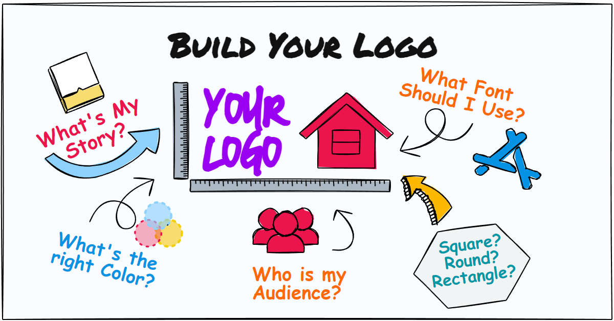
Your business is your brand and when you start a new business, or rebrand your current business, the first critical component that represents your brand is your logo! This article will show you how to design the right logo for your business.
What makes a good logo?
A good logo clearly represents your brand, product or company message. It should be easily recognizable to your customers and elicit a positive emotional response. There are several key elements that can make a logo successful. These include:
8 Simple Steps to Design The Right Logo
Everyone wants their brand or company to have a strong presence in the market. The elements which drive your logo design are going to be different for each business. Your logo needs to explain who you are, what you do, why you do it and how you do it. The type of logo, the design and the colors of your logo can all be used to promote a strong brand identity, convey a sense of trust and may even solve your customer’s problem. Your logo needs to be simple yet effective. Above all, your logo needs to appeal to your perfect customer.
Let’s look at the steps and the components that go into creating the perfect logo. As you go through these steps, a picture of your perfect logo should start to develop.
Step 1: What’s your story?
A logo communicates the personality of your brand or company. The better you know your brand, the better you can come up with ideas for your logo and start forming the picture of your perfect logo.
Ask yourself the following questions:
Step 2: Who is your audience?
Who is your target audience? What does your perfect customer look like?
Your logo needs to relate to and connect with your target audience: your perfect customer. So, what does this customer look like?
Step 3: What do your competitor’s logos look like?
More than likely your competitors may already have established brands. Some may be commonly known businesses or household names. Each one of your competitors have developed their logos and branding using a similar process as this. Some logos may stand out more than others while some do not appeal to you at all. Also take a look at the logos of other companies who are a similar type as yours.
Your logo should set you apart from your competitors. As you look at each one, focus on the positive aspects and try and picture what would make your logo different and stand out from the rest? Color, style, design, etc.
Looking at each one:
Looking at all:
Step 4: Choose your colors
Color is one of the most powerful forms of non-verbal communication and offers an instantaneous method for conveying meaning and messages in logo design. While it is important for the colors you use to support your brand, it is also important to use the right color to convey your message and the feel and tone of your brand.
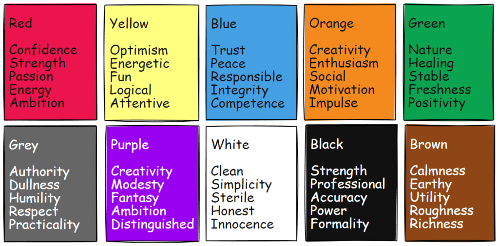
Different colors can stir up different emotions, moods and feelings. Colors can also have different meanings in business.
Red: Red gives people the signal to act. It is also a color of strength and energy. However, you do not want to overuse this color. When using Red in a logo, use it as an accent color. A touch of red can help portray your business as energy- driven and exciting.
Orange: An orange logo sends the message that your company is friendly and cheerful. This makes it a good choice for brands who want to send a light-hearted not too serious message, but still show confidence. It is a beneficial color for hotels, travel companies and resorts and can stimulate social communication. Orange is friendlier, approachable and less aggressive than red and great for inspiring consumers to act.
Yellow: Yellow is not recommended as the primary color in a logo unless it is used with other bold colors such as red, black or blue. Color experts recommend yellow for use in children’s industry as this color’s meanings include stimulation, creativity and wisdom. It is best to avoid the use of yellow if your brand items are costly or luxurious men’s items as they would be perceived as unsophisticated. Also avoid dull versions of yellow (mustard) as these portray ill health and disease.
Green: There are no other color meanings in business that symbolize growth and abundance as much as Green. It is used invariably to advertise safety in drugs and medicines as well as a sign of vegetarianism. Green represents nature, prosperity and money. It is especially recommended for health and healing. For financial websites, dark green is a good color while lime green may be used in a logo as an accent or in a whimsical nature.
Blue: Stability and depth are the best meanings of color Blue as far as its business usage is concerned. Most conservative corporate businesses have blue in some form or the other in their logos, business cards and brochures etc. Similarly, communication, Hi-tech, computer products, water industry, filtration, swimming pool cleaning businesses etc. also always use blue. Health, wellness and travel industry typically use light blue while political and religious organizations tend to use dark blue.
Purple: Purple is an ideal choice if you wish to combine the passion of red and the stability of blue. Purple is a sign of wealth, wisdom, royalty, and magic. It is commonly used for women and children’s products and emerging with men’s products. Lavender is considered ideal for businesses which sell hand-made products, artwork, and crafts. Avoid dark purple as it can have a meaning of gloom, sorrow or frustration.
White: The use of white color meaning in business is cleanliness and hygiene. It indicates calm, simplicity and organization. On the negative side, some of its meanings include coldness, detachment, sterility and disinterest. White can be used as the primary color where the logo is used on a dark background. With websites or other media that use white as the background, white should only be used in a logo to show negative space.
Black: Black is traditionally seen as a symbol of professionalism and seriousness and can be used to represent luxury, elegance and sophistication. Black is used in logos and in business for style and trendiness. However, black is better used in a logo to make other colors stand out. It works best on a white or light-colored background. Use white instead on a dark background.
Pink: Pink is best used if your target audience are women or girls. . It is also associated with sweetness and is seen in logos for sweet foods like ice cream and donuts. Pink is also seen as a “fun” color and can evoke a sense of playfulness.
Gray: Gray is not a color commonly used as a primary color in a logo but works well to balance other colors as it is a very safe and neutral color. It is ideal for legal and financial industries as well as for creating a hi-tech look by combining with blues or yellow etc. Positive meanings of grey color in business include professionalism, maturity and dignity.
There is nothing that says you need to stick with only one color. In fact, the best logos use a blend of different colors. Colors can be complimentary to each other for a dynamic look. Or you can use gradients or different shades of the same color. Some logos look good with multiple color schemes.
How your logo works with background colors also need to be taken into consideration. Will your logo be used with a white or light-colored background or a dark or black background? Will your logo only been seen with this background or will it be used with a full range of colors. You may need to consider variations of your logo, one for white or light-colored backgrounds and one for dark or black backgrounds.
Step 5: Typography
As colors can be used to convey the personality of a brand, so to can the typography, or font, used in the logo. The type of business can also determine the best font to use. Here are a few general tips for selecting a font for a logo:
Some popular font choices for logos include sans-serif fonts like Helvetica and Arial, and serif fonts like Times New Roman and Georgia. Ultimately, the best font for a logo is one that your audience will connect with, effectively conveys the desired brand personality and is legible and versatile.
Step 6: What is the right logo orientation?
One aspect of logo design is the orientation of a logo. How you are going to display your logo and in what context your logo is used in other designs may dictate how your logo needs to be constructed. Your logo is in essence a graphical image. As such, the design will dictate if the image dimensions are square (or close to square) or significantly longer than it is tall.
An example of usage, and more than likely the primary use of your logo, is in on a website. The overall shape of your logo may be impacted by or define the design of your website. Take for example these two logo designs:

The first image is an example of a vertical logo. Using this style will take up more space at the top of a web page and will force the rest of your web page down thereby throwing off your overall design. The second image is an example of a horizontal logo. Using this style may give fit better with common website designs and give you more real estate to convey your message in the top portion of your webpage. You could shrink down the first example to fit your web page design, but to do so could diminish the appearance and strength of your logo.
While the use of your logo and how it appears in other media design are important, it is more important that your logo makes the statement you are looking for, conveys your brand personality and appeals to your perfect client.
Step 7: Choose the style for your logo
By now, the picture of your perfect logo should be forming in your mind. The next step is choosing a style of your logo design. While this step is important, it is not a final decision. Nothing says you have to pick one and that is all you get. You may want to try two, three, or more before making a final decision. Each type has merits but only one type is the right type for your perfect logo.
Logos can also use a combination of styles to create a unique design. Some of the examples below incorporate elements of more than one style.
* Logo images used in this document are the property of their respective owners and are used purely for example purposes only.
Minimalist
A minimalist style logo focuses on the minimal essentials but can still make a bigger impact than everyone else’s. They tend to be clean, bold and simple designs made of one or two colors and a single font. Most modern design logos use this style as it gives a fresh new look. A good minimalist design can be eye-catching and memorable.


Mascot
Mascot logos are the most memorable and recognizable of all logos. For some companies, their mascot is their brand identity; their brand ambassador. Your mind instantly associates the mascot to the brand. A logo which properly incorporates a mascot can be very powerful brand recognition tool. Is your brand represented by a mascot? Then this may be the right logo style for you.


Signature
A signature logo, also called a wordmark, is a logo made up of the full name of the company or an individual’s name. Sometimes the type of business, slogan or a representative icon is incorporated into the logo. The font style used is typically more extravagant but can also be quite simple. This type of logo should represent the company’s values through its visual characteristics.


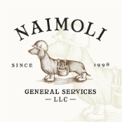
Vintage
Vintage or “Retro” style logos are usually constructed in circles or shapes and use intricate patterns with a mixed range of older style fonts that give the logo an older feel like logos from the 1920s to 1970s. More commonly, you will see this style used in badges. A vintage logo typically uses muted primary colors and incorporates borders into the design. A vintage logo can give an impression that your brand has been around for many years. If you feel the vintage style will appeal to your perfect customer and it matches your brand personality, you should explore this style.

Watercolor
The use of watercolors has been a recent trend in logo design. Used properly, a watercolor affect can provide a unique texture to your logo where the water effect changes the saturation of color and how it spreads across your logo. It can also be used as an accent or to blend and interact with the background. It is a great way to add visual interest to your logo and can also give your logo an appearance of being hand made. This type of logo can have a big effect on your brands personality and how it appeals to your perfect customer. It needs to be the right design style for you.


Hand Drawn
A hand drawn logo can make a brand or company more personable or approachable. A hand drawn logo will take a considerable amount of time to create but the extra time can be worth it if it send the right message and can project a kind of down-to-earth, low-fi, or rustic brand identity, one that suggests old-fashioned methods of craftsmanship.
Typically, a signature type logo is created with existing font typography where a hand drawn signature logo would be created from a person’s actual signature. Because no signatures are the same, this style is a way to guarantee a unique logo. This style would be better suited where the brand is the person and not so much where the brand represents a company.
Another approach to handmade logos is to incorporate a sketch of an object, scene or idea. A sketch style logo is a great choice if your business is aiming to create a free and floating atmosphere. It would be good for businesses relating to customer experience or environments like coffee shops, furniture stores or farms.


Step 8: Create some rough sketches
By now, the picture of your perfect logo should be fairly clear in your mind. Now it is time to try and get your picture down on paper. Just think, before the digital age, all logos were created with pen and ink and they all started with as a sketch.
Don’t try and get it right the first time, just let your imagination go and create some free form doodles. Once you have the basic ideas, then create some variations on your ideas. If you are not happy then start again with some new ideas and see how they look.
Once you have a good concept, start adding color. Once again it does not have to be perfect. Work your ideas until you are happy with the result.
Put it all together
Now you know what it takes to create the perfect logo for your business, it’s now time to create your logo. If you are a graphic artist and have the skills and tools necessary to do so, you can create your own. Like most people, you will need to use other means.
There are many tools available online that you can use to create your logo. You can search Google for Logo Makers and Google will find several of them for you. Some of these services are free and you can actually create a decent logo with them. However, you get what you pay for. The designs of your finished product are done through an AI process without any human element. They are typically rudimentary in design and will more than likely not be enough to create the perfect logo you have in mind. You are also not guaranteed to get a unique design.
If you really want a logo that:
Your best solution is to hire a professional logo designer.
Are you ready to get started? Contact Us or Submit Your Logo Order.

